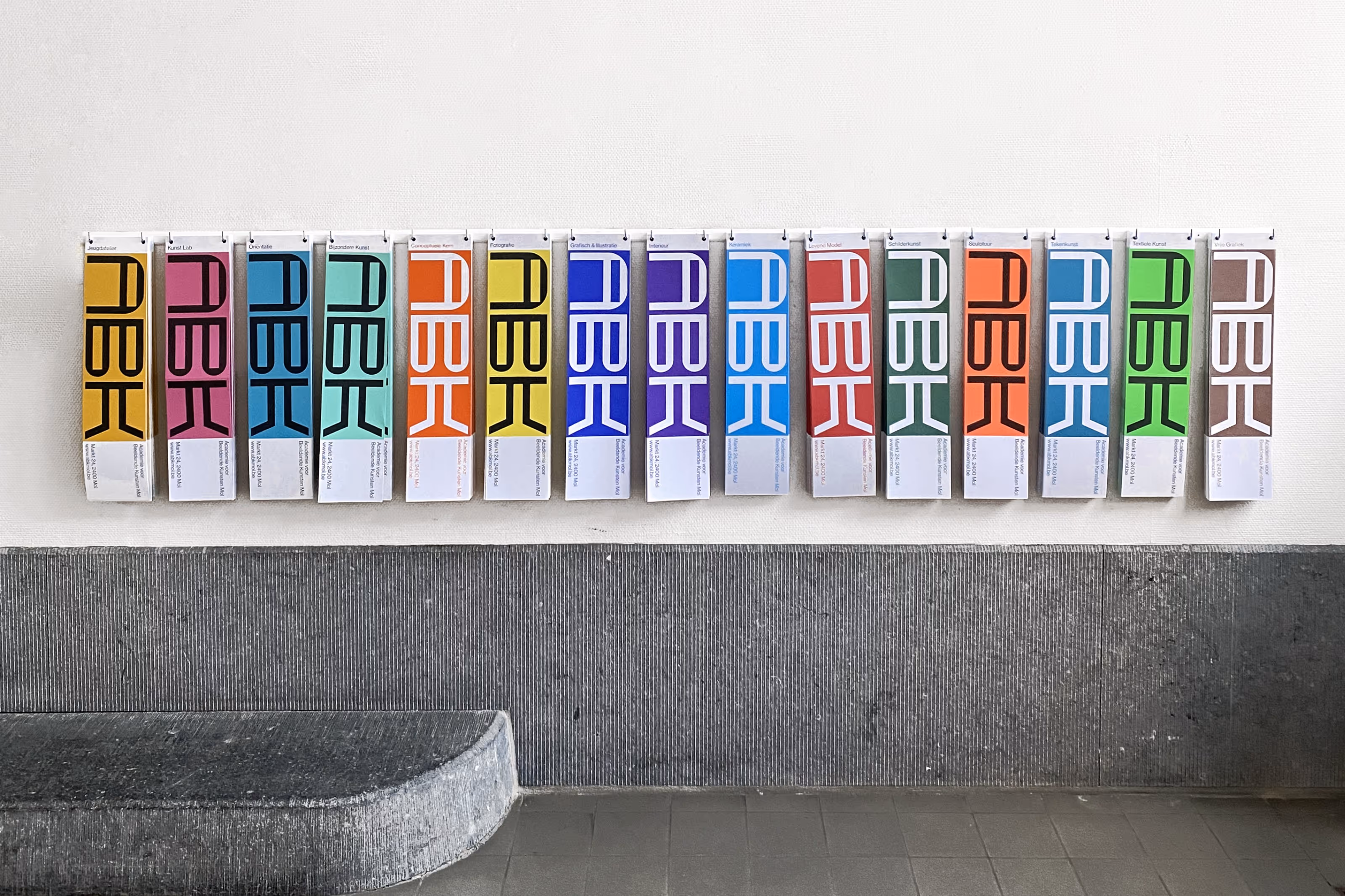
Academie voor Beeldende Kunsten Mol, a bespoke typeface and visual identity. Elements of the former logo of ABK Mol were used as the base to create a bespoke typeface for the visual identity of ABK Mol. The aim was to create recognisable but aesthetically new letterforms that would be used as the visual language of the school and not just as a static logo.
The letters of the logo are drawn on a square grid, which inform the construction of the type, exploring the boundaries of legibility, but keeping it in mind as an important aspect within the communication. The typeface is easy in use and can be applied by all the students and teachers in different forms of communication, evoking the experimental and playful nature of the art school. Leaving room for experiment was key in the development of the visual identity, as it is a core value of the school.
Do it yourself! These are the foldable leaflets for the new semester at ABK Mol. Time to pick your course...
Us By Night
Gabonsa festival
Traum Club
Enfnts Terribles Magazine
Fragille Jewellery
Doel Festival
Creative Belgium Awards
Klub Dramatik Festival
Brussels Street Photography Festival
Antwerp Art Weekend
Arte Antwerp
RE Antwerp
Transit Festival
Re-Arrange
RSC Anderlecht
Back To Back
FOMU
Fooding Magazine
Indrikis Gelzis
M HKA
Briquet Restaurant
Kringwinkel
Nacht van de Beeldende Kunst
Inma
ABK Mol
Everyday Gallery
iMAL Museum
HART magazine
Circuit
A-Z
Tom Volkaert
Luddites
Okkaido
Onkruid
Academy of Fine Arts Antwerp and the Royal Conservatoire Antwerp